Born to Lose, Live to Win: A Motörhead Pinball Design Journal
By Brad Albright
Pics by Matt Benzik and Brad Albright
Hey y’all, Doc here for just one second to set this up. Probably all y’all have seen the Motörhead homebrew pinball machine that debuted at TPF this year. I’d say that calling this game a “homebrew” is a disservice, but let’s face the facts: homebrewers have upped their games in the last decade. For the uninitiated, a “homebrew” pinball game is exactly what it sounds like. It’s a pinball machine made by a single person or group of people instead of a pinball manufacturer. Haven’t seen one in the wild? Well, they mostly show up at shows and pinball expos.
In the past few years, we’ve seen homebrews evolve from basic retro rethemes to something else entirely. These days, you’ll see top notch mechs, full-on layout designs, and some of the best art and programming this side of a Spooky buttercab.
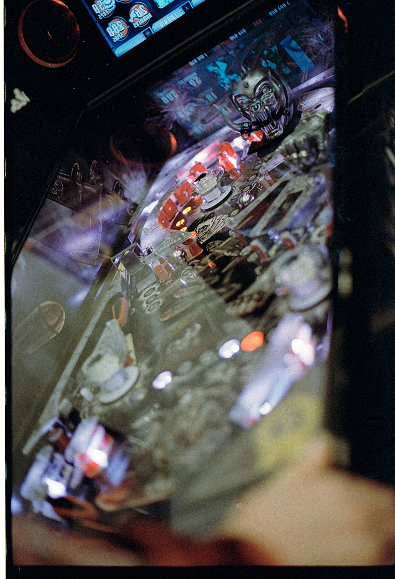
David Peck aka rotordave on pinside had a mission: to bring a retro feeling Motörhead pinball machine to life. For most of us, that would be a pipe dream, thrown away as soon as the bong hit wore off — but Dave is different. He’d already done a (really great) Led Zeppelin machine a few years before the Stern game, but for this one he wanted to go nuts. And nuts he went. He recruited perennial fave pinball artist Brad Albright as the art director, got Matt Kemp to help with programming, and… ended up creating a smash hit that took TPF by storm.
We were lucky enough to get Brad to write about his process working with Dave and company and what it was like to reveal a surprise smash hit at a pinball festival. Did it break? Who has the GC? How much brisket got spilled on it? The only way to find out, intrepid goofenbacher, is to read ahead.
Brad’s Rad Motörhead Hoedown:
David and I struck up our friendship and collaborative rapport back in 2018, all the way across the world from Dallas, Texas to Auckland, New Zealand. I had initially heard him discuss his new pinball project as a guest host on the infamous Head2Head Pinball Podcast, and he was looking for an artist to help him do a backglass for it. I reached out immediately, and we promptly began working together to finish his retheme/reimagining of a 1976 Bally ‘Freedom’ into an mid 70’ era appropriate “what if Bally made it” Led Zeppelin machine. (See his fantastic process blog on Pinside here).
1976 Bally Led Zeppelin (retheme)
Amazingly, we had never met in person, nor even spoken on phone or zoom, until the 2024 Texas Pinball Festival! I now consider David one of my best friends in the world. As David says, my hyper attention to visual detail pairs well with his kiwi ‘let’s get this done!’ attitude.
Approached by a RotorDave with a mission
In February 2022 David asked if I was a fan of Motörhead, to which I replied “F* yeah, loudest goddamn show I ever went to!” Which…no lie, it really was. Thank god for that bathroom attendant with earplugs in his assortment of colognes and mouthwashes! David had made up a flipping whitewood and cabinet from scratch over a few days (!) and had a couple of basic ideas on what direction he wanted to go, art wise.
I was excited to take a crack at a fully original game layout and complete art package, which would be so much more extensive than anything we had tackled with Led Zeppelin. No stone unturned, it became the deluxe real deal… cabinet, backglass, playfield, plastics, art blades, 3D layered inside back panel, apron, not to mention animation and LCD user interface, sculpted toys, and finally a topper with both a moving 3D sculpt and printed backdrop illustration.
Retro-Hybrids: Where the Inspo Came from
David and I share a love of 80s games like Centaur for fast, aggressive single-level design and punchy, high-contrast artwork. The current trend towards complex, multi-layered playfields and hyper-saturated technicolor artwork led both of us to aspire to something more nostalgic playfield-wise - however, still running with the large LCD display and deeper rulesets and coding that modern pinball players require.
David has coined this fusion of eras “retro-hybrid”. David bought in his New Zealand buddy Matt Kemp to handle the code side of the project. So we really have a three-legged stool now: Matt on the code, myself on the art, and David on everything else! Each needs the other to make one whole. David and I agreed that his hybrid game design and a 1980s limited palette art package would play very nicely together and totally fit the vibe of the Motörhead theme.
More than just Lemmy inspired, it had to feel like Motörhead
Lemmy is synonymous with Motörhead of course… but we didn’t want to make Lemmy: The Pin. We wanted to make something Lemmy himself would play… He was a gamer and gambler, after all! So it wouldn’t be a music pin about the musicians themselves, touring, albums, etc… instead we took inspiration from the world suggested by their lyrics and album covers. Something fast and aggressive with a defiant devil-may-care attitude, letting the player fight against evil with WWII era weaponry. (which Lemmy had a huge collection of) And like the world suggested by the album ‘Bomber,’ we landed firmly on fighter planes, motorcycles, and aerial dogfights.
Creating a Fist: Adventures in 3D modeling
Being a self-directed project, I took this opportunity to learn some new tools while expanding my reach and learning to better dial in imagery with 3D tools. That meant both sourcing and modifying preexisting 3D models, and building original assets from scratch.
Using Blender, I was able to customize 3D assets and pose elements within a virtual photo studio, adjusting focal length and light sources, twisting and turning elements like vehicles and bombs to focus in and lead the eye across the backglass or playfield as I saw fit. Then, my line-art could be manually drawn with a better foundation that was easier to work with later in the process.
Playfield art is a particularly challenging and rewarding process, as the physical layout restrictions of mechanical elements, lights and inserts all define an extremely unique shape, unlike any traditional ‘canvas’. Treating it as a dynamic storytelling device as well as a user interface to guide the player, the playfield needs to be clean and legible, as well as engaging and full of detail to reward repeat viewing.
The cabinet art was modeled in 3D and rendered instead of being drawn or painted, as I wanted to explore a photorealistic style with the physical layering of sheet metal and manually distributing rivets in an imperfect, textured way. With a 3D model established, I could then explore texture mapping, stenciled art, bullet holes, and lighting effects to render and apply to the cabinet, representing the physical game cabinet as a hyper-real Bomber plane fuselage.
How to create the art for a pinball playfield
Around this time I had also begun shifting my drawing process from Procreate on the iPad Pro to the more full-bodied Clip Studio Paint, allowing a more seamless flow between mobile and desktop platforms. While learning new software DID slow my workflow considerably, the benefits outweighed the cons and really streamlined the process of developing many smaller assets in a way that remained fluid and at an extremely high resolution.
Perhaps the most useful of Clip Studio’s functions is the ability to use File Objects (similar to Adobe’s Smart Objects)… separately linked files that can be individually placed and assembled in a composite document, while remaining fluid for separately edited and updated back in the main document on the fly. This is particularly handy when filling out a playfield, where individual elements could be drawn separately in their own smaller documents, then adjusted over time as needed while updating in the full playfield layout.
Backglass with Attitude
The backglass needed to make clear reference to the ‘Bomber’ album cover, while having its own identity… updating and modifying the scene to suggest the dogfight action of the gameplay and introduce the player to the kind of aesthetic choices I would be making throughout the playfield below. High contrast art, primarily black, white, and grey with pops of red. Grungy textures and a foundation of technically precise linework supported by loose, organic brush rendering.
Dabbling with motion graphics and animation in addition to 3D modeling, character and vehicle design, user interface and playfield design, and myriad different canvas shapes in addition to the usual challenges of detailed line art illustration, this is truly the most I’ve ever invested and stretched myself for a project. And I’m proud to have done it in such a trusting, positive collaborative context.
More bold, more daring, more transparency
Making a Home-brew machine allows us to show the game exactly how we wanted to make it… taking risks with the retro layout and art choices that likely would not fly for a wide release on the mass market. But I think they’re bold, honest choices that represent the band, the music, and who we are both individually and as collaborators.
My hope is that the project will also display some lesser-known behind-the-scenes knowledge and technical design skills that are familiar to industry folks. Things necessary for collaborating on games, such as developing vector cads for playfield and plastics, developing artwork alongside those cads while being flexible to change, working to a manufacturer’s cabinet specs, representing likenesses and vehicles, developing on-screen screen UI, 3D modeling playfield toys and toppers, animation and motion graphics, and of course using all of the above to support the gameplay and guide the player’s eye with shot lines, inserts, and all the rest.
It really was a huge labour of love project from all involved, and it was extremely cool to get the game to TPF24 and let people get their hands on it for the first time.
The constant queues and 1000+ games played (not to mention the laughs and grins as people got “fisted” by the game) was a great payoff for all the effort we all put into the game!
You can check out David’s Motörhead Announcement thread on Pinside here:
Editor: Are we gonna end with Brad making a fisting reference? YOU BET YOUR SWEET BIPPY WE ARE. Congrats to everyone on the team for making this happen. Now let’s get this into production. I can’t wait for an expo. THE ACE OF SPADES (my air guitaring commences as you gently turn off your phone or shut your laptop)


